WSIB Innovation Lab
The WSIB is essential to Ontario's health and safety system, offering insurance, financial support, healthcare, and help in returning to work after injury or illness.
WSIB Innovation Lab is a special R&D unit within WSIB that helps identify problems across departments to create proof-of-concept solutions.
This term, our projects included interviewing for accessibility needs, researching employee wellness, creating a mobile and desktop app for asset management, and designing an email plug-in to identify and organize important messages.
Job Role
UI/UX Design Intern
Tools
Figma, Maze, Miro
Timeline
May 2024 - Aug 2024 (4 months)
Discipline
UX Research, UI Design, User Testing, Product Design
group photo of the design team <3
Team
4 Designers 9 Developers 4 Communication Specialists 3 Leads


Project #1
Asset tracker App
Modernizing the management, organization and tracking of IT assets

💢 The ProblemEvery co-op term, managers are required to assign devices such as laptops, monitors, and other peripherals.
This process is currently done with excel and can be tedious, time consuming, and prone to errors.

💡The SolutionA digital mobile app that leverages QR code technology to manage, organize and track IT assets within and across teams.
The idea is that every asset has a unique QR code associated with it that allows it to be scanned and managed within the app.

📃 Some contextThe previous design teams at WSIB had conducted some preliminary user interviews and created low-fidelity mockups for various user flows. Their work gave us a good overview of the general functionality and layout of the app.
Old Designs


It’s a good start! But we think it could be much better.Our team’s goal was to flesh out, test, and expand this app to desktop (and potentially more teams in WSIB).
👀 Preview of Final Screens & PrototypesMobile User Flows

Add Assets
Seamlessly add an asset to the app by filling in the asset details and assigning the asset to a user.

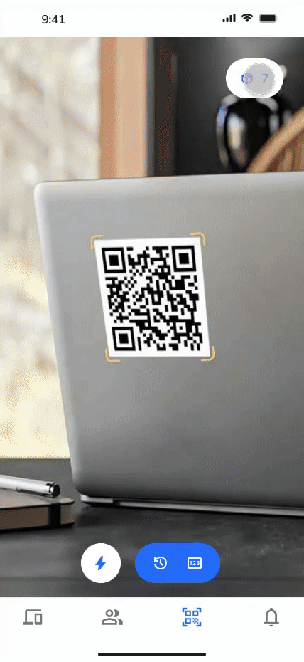
Scan Assets
From the scan page, scan the unique QR code attached to every asset to view asset details or add the asset to a batch.

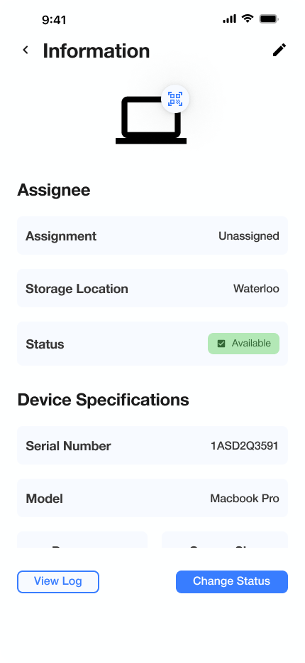
View Details
View and edit asset metadata such as owner, health status, and warranty expiration date within the asset details page.
Batch Return
While offboarding employees, bulk unassign and return assets to a specified location after batch scanning their assets.
Desktop Designs

Dashboard

Assets - List View
🔎 First … User Research!In order to better understand the pain points and needs of the new user group, we conducted user interviews. Our team developed an interview guide and interviewed a team lead and a department manager.
Key Questions
Who within the team tracks the assets?
What is the current process of tracking assets?
How often do devices get cycled?
How are maintenance processes handled?
What are some difficulties you encountered?
We gathered a lot of information … lets Affinity Map it!


Key FindingsOverall, there was a large overlap of pain points & needs between the old and new user groups
😢
😍
🏠 Revamping the home screen.Design Challenge #1
A good home screen should be simple, yet effective. It serves as a centralized hub, providing easy access to essential data and acts as a starting point for user actions.
This was the previous home menu:


Home Page Explorations
We explored different ways to display asset and employee information in a card view. However, the complex groupings and information cluttered the screen and was overwhelming.


Sometimes, Simpler is BetterWe settled on a list view and split assets and employees in the bottom navigation bar.

Final Home Screen
Design Challenge #2
🤳 Creating a seamless scanning experience: Single vs. Batch ScanQR code scanning allows interaction between the physical asset and the digital app.
Users can either scan a single asset for a quick view of it’s details or start a batch scan to return multiple assets to a specified location.
In the old designs, users would switch between both modes by toggling the “Batch Scan” button.
Old Designs:


Batch Scan
Single Scan
Our goal was to create an intuitive interface that accommodated both scenarios, ensuring fluid navigation and clarity. After many iterations, we came up with a solution.
Scan Screen Iterations

Version 1
Full screen camera view for an immersive experience.
Scanned devices appear as clickable pills and stack up for batch scans.
Added action buttons: upload picture, enter serial number, flashlight, and scan history (left to right).

Version 2
Grouped buttons into actions vs. input options.
Got rid of the “upload picture” feature.

Version 3
Since it was unclear whether the user was completing a single or batch scan, we added a pill to switch between them.
However, this felt visually cluttered and clunky to use.


Final Version
Instead of stacking multiple devices, added a batch button (top right) that functioned similarly to a shopping cart.
Scanned assets appear as a card where you can choose to either view asset details or add them to a batch.
Action buttons were also grouped closer together to improve ergonomics.
Final Scan Prototype

Asset Card
Preview of asset details + action buttons:
add to batch: return multiple assets to a specified location
view details: view full asset details page
Batch Scan Button
quick access to scanned assets
Action Buttons
Grouped together in the center:
flash
scan history: view recently scanned assets.
serial number: search for assets using their serial #.
Design Challenge #3
🖥️ Designing for desktop: Adding complexity while keeping things consistent.When transitioning to the desktop version, we tried to maintain a cohesive user experience while accommodating the added complexities that come with designing for desktop apps. This process involved rethinking layouts due to larger screen real estate and prioritizing content to align with desktop user expectations.
We designed desktop exclusive features with the intent of providing a more technical experience.
Some Desktop Screens:
Assets - Split View

Assets - List View

Add New Asset

Device Logs
By adhering to consistent design principles and leveraging familiar elements from the mobile interface, we created a desktop experience that felt both familiar and sleek.
📝 Design CritiquesBetween every large iteration, our team would hold design critiques. This was a space for discussing design choices and allowed us to ensure consistency and align on goals.

📊 User TestingNear the end of the project, we tested 6 user flows with 12 participants using the software Maze.
This allowed us to gather valuable insights, identify pain points, and make data-driven improvements for a more user-friendly experience.
The usability test scored 81% on Maze.


Click to view full report!
What else did I do @ WSIB?Project #2
Email Cleanup

Overview
WSIB urged staff to transfer important emails and files from their inbox to secure storage like Dropbox or SharePoint by deleting emails older than 3 years. We created an Outlook add-on in three days during a mini hackathon.
Progress
Designs have been finalized and handed off to the development team!
Project #3
mACHINE VISION

Overview
We designed a webapp that allows health professionals to keep track of their patients health and healing progress by using machine vision to examine exercises for quality of form.
Progress
Designs have been finalized and handed off to the development team!
Project #4
wellness project

Goal
Gain insights on the current company wellness and potentially improve the current wellness programs
Progress
We completed landscape reviews of workplace wellness best practices and applications, conducted 8 user interviews, and summarized our findings in a presentation for the wellness team at WSIB.
Project #5
accessibility workshops

Goal
Understand team workflows across WSIB to identify common issues and discuss solutions for improving accessibility.
Progress
Since June 2024 we’ve been assisting the accessibility office conduct workshops. In total, we’ve completed 4 workshops and over 8 teams across WSIB.
Reflection & Takeaways😊Taking ownership over a project is so rewarding.
We were given a lot of freedom over the delegation of resources, scope, and design process. This flexibility allowed us to approach projects with a fresh perspective and really make them our own.
👩🏻👨🏼👨🏿🦱👨🏻Your teammates have so much to offer! Learn from them.
Over the term, I learned SO MUCH from my fellow designers. Whether it was tips on animating within Figma, design best practices, or dealing with variables and advanced prototyping, I owe so much of my growth to them <3.
🙋🏻♀️❓Don’t be afraid to challenge ideas and ask questions.
Design critiques were such an important space for us to present, discuss, ideate, and challenge each others designs. It pushed us to articulate and justify our design choices clearly.
🔁When you think you’re done, you're only halfway there!
There were so many times where we thought a design iteration was the final version. However, that was not the case! Our designs were constantly evolving in a seemingly never-ending loop of feedback and iteration.