
FutureVault - Dashboard
As an intern at FutureVault(FV), I was given a lot of ownership over various projects. One of the first major features I was tasked with was the Dashboard feature. WSIB Innovation Lab is a special R&D unit within WSIB that helps identify problems across departments to create proof-of-concept solutions.
My focus was to ensure that these dashboards not only displayed a concise summary of data but also provided updates on tasks within each user's vault. This functionality was crucial in introducing users to various features and aspects of the platform that could enhance their ability to manage their data more effectively.
Job Role
UI/UX Design Intern
Timeline
Sep 2023 - Dec 2023 (4 months)
Discipline
UI Design, Product Design
Problem Statement
Users (Enterprise Administrators, Advisors, and Clients) want to see Dashboards that summarize the data, checklist status, and activity within their vault.
The Approach
Challenge
FutureVault’s platform is multi-tiered.
One of the selling points of FV’s product is that it provides a secure document management system for multi-tiered organizations. Many of their customers wish to manage documents across their organization, clients, and network of Trusted Advisors. The tiers are as follows:
Enterprise (Administrator)
Advisor (Admin/Rep of Subgroup)
Client (End-users vault)
In order to create a seamless experience for users across this system, the Dashboard feature must be designed to accommodate the varying data and features across each tier.
Proposed Solution
Dashboard Components.
Our approach was to create a collection of dashboard components that can be arranged in a grid. This way, we could pick and choose which components will be included in each tier—It allows for there to be overlapping and unique components.

This approach has multiple benefits:
Branding and Aesthetics: Custom components can be designed to align with the product's branding, providing a consistent and professional look. A well-designed dashboard enhances the overall aesthetic appeal of the product.
Scalability and Flexibility: As the needs of the product or its users evolve, components can be easily added, removed, or modified. This scalability ensures that the dashboard remains useful over time.
Efficient Data Visualization: Components can transform data into charts, graphs, and other visual formats, making it easier to identify trends, patterns, and outliers. This visual representation is often more effective than lists of numbers or text.
Enhanced Interaction: Interactive components allow users to drill down into details or adjust parameters to see different views of the data. This interactivity increases engagement and helps users find the specific information they need.
Inspiration
Exploring Dribble and Behance for UI/UX inspiration was incredibly useful, these platforms are rich repositories of design work from around the world. They offer a vast array of innovative ideas, trends, and visual styles, making them invaluable resources for designers seeking fresh perspectives and unique solutions for their UI/UX challenges.
Design


Wireframing
Working with the product manager, I designed seven components for the first implementation phase.
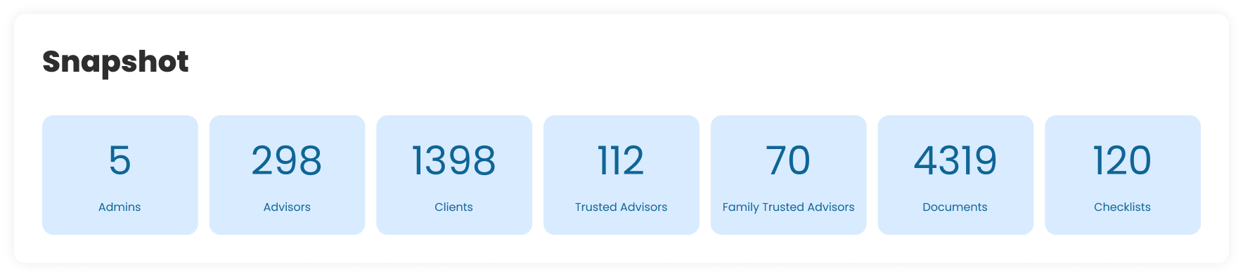
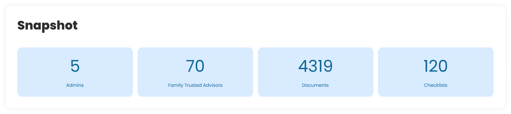
Snapshot
This component serves as an entry point for new users, presenting critical data points at a glance.
(Enterprise Version)
(Advisor Version)
By highlighting key metrics, the component not only showcases the platform's capabilities, but also allows users to monitor and manage their data more effectively through immediate insights.
Users Table
This component offers insight into the distribution of user types on the platform.
Such a clear breakdown can help administrators quickly assess the platform's user composition, which is essential for resource allocation, security management, and understanding user engagement.

Client Breakdown
Provides an overview of client statuses within a platform, categorizing them as Active, Pending, or Inactive.
This visualization is useful because it allows platform administrators or business managers to quickly gauge the current engagement levels of their client base.

Checklist Status
Provides a task management tool that is useful for users in all platform tiers as it offers a clear and immediate overview of progress on tasks.
Moreover, the component aids in identifying areas that may require additional focus or resources, promoting an organized approach to task completion.

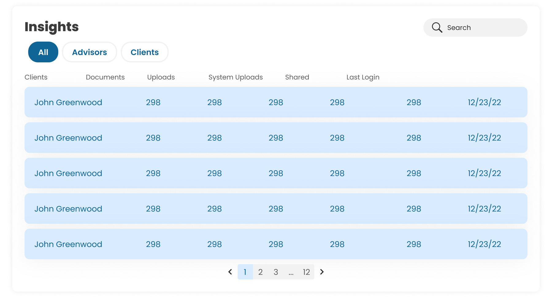
Insights Table
A valuable tool for administrators to analyze user behavior and optimize platform operations.
This component streamlines data management by offering segmented views of user metrics, such as engagement and document handling, facilitating quick and informed decision-making. Its search, report saving, and CSV export features allow for efficient data handling and personalized report generation.
VERSION 1

VERSION 2

VERSION 3
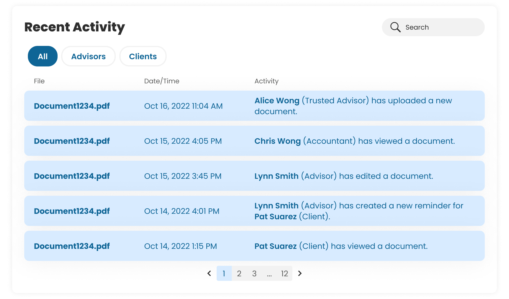
Recent Activity
This feature provides a chronological log of actions taken by users within the system.
It can be useful for tracking document interactions and user engagement, offering transparency and oversight into the workflow.
Storage
A visual and quantitative analysis of data usage.
This feature is crucial for managing data capacity, planning for future storage needs, and potentially highlighting the need for clean-up or archiving to optimize storage allocation.

Mockups
Sample Dashboards
When you put it all together…

Enterprise Dashboard

Advisor Dashboard

Client Dashboard
Learnings
Closing Remarks
🌱 Personal Growth!
The development of this feature was a huge learning opportunity that deepened my understanding of the feature development lifecycle within an agile software environment.
I’m so thankful for the product managers and developers that I worked with who greatly supported me through this project! It feels incredibly fulfilling to contribute meaningfully to the user experience of FutureVault's platform.